Saturday, 24 October 2015

Screen Printing - Bronze Fawn cushions and Villa San Michele, Capri.


I'm feeling revitalised after a short holiday in the Campania area of Italy visiting the ancient sites of Pompei and Ercolano. I also peered into the crater of Monte Vesuvio, and walked the narrow streets of old Napoli (all lived up to my expectations).

Straight back to printing rows of my favourite Bronze Fawn cushions. There's something very contemplative as well as addictive about repetition, maybe this is why I opted for a career as a textile designer. Repeat pattern and form even at it's most simple is of endless interest and inspiration.

Here's what's involved to make a Bronze Fawn cushion.

Plaid background - Natural linen is screen-printed with a Black Reactive (Procion) print paste.


The cushion pieces (above) are then steamed to fix the dye before first a cold, then a hot wash until the excess dye is removed. They are then re-pinned to the print table and the Fawn is printed with a textile adhesive (below). The shrinkage/movement of the fabric during washing is allowed for in the original plaid print, but exact registration is impossible, therefore each Fawn is an individual..!


The adhesive is allowed to air dry and a sheet of textile foil is cut to cover the adhesive print. This is then heat pressed for 30 seconds (I have an industrial sized press that I use for this), and the foil peeled off.


Two by two...


The above are soon to be made up, in the meantime, here's one that I prepared earlier. Every one is wonderfully unique and available in my shop priced £59.00 (here).


The Villa San Michele on the Isle of Capri was particularly inspiring. Former home of the Swedish Doctor, Philosopher and animal lover Axel Munthe. It's a house of pattern, order, beauty and extreme calm. Now preserved in its original state as a museum, it's a tranquil and unhurried oasis amidst the claustrophobic bustle of Capri.

Here's a few details from the Villa (from a textile designer's perspective)...

Dining room vista...


Indigo, Pewter, Alabaster and Umber colour...


Rabbits detail...


Nice jugs...


Kitchen vista...


Every one different! Copper and blue view...


Bedroom vista...


Lastly, (before I bore you with my holiday snaps!) - the Sphinx vista...


“What you keep to yourself you lose, what you give away, you keep forever.” 
― Axel Munthe

Friday, 9 October 2015

Inspiration - Pocket Squares


There's no doubt in my mind that digital printing is an amazing technical print innovation in the textile industry, however after solely designing and digitally printing furnishing fabrics and accessories for about five years, I realised that what actually motivates me to get out of bed in the morning is hands on making - and screen-printing in particular.

This week the studio's been brightened by a new screen-printed accessory in development - pocket squares.


The idea of printing these originated a few months ago when my son Josse bought his first bespoke suit from the tailors 'Gieves and Hawkes' of Savile Row fame, and asked if he could come down to Devon and print a silk pocket square to set it off.

He looked through my screens and decided the Bamboo design would be perfect. I then gave him a crash course in mixing dyes, found a length of silk that he could use and after sampling printing colours, we printed one for him and one for my nephew/his cousin Tom (who's 30th it was the following day).


I've stayed with the Bamboo imagery, although I've re-jigged the design a little; after all it was much admired and intensively market tested on Josse (graphic designer) and later Tom (product designer)!

Here are a few of the new colourways...


These satin squares are heading off to be beautifully hand rolled and with a fair wind, will be packaged in presentation boxes and on sale in my shop in a few weeks (priced £38 plus postage). If you would like to order one, please email me directly for postage costs worldwide at sam@sampickard.co.uk

Thanks to Josse for the inspiration! X

Saturday, 3 October 2015

Colour from the Season - Grey Squirrel Grey

Last week I was thinking that I might quite like to draw a Squirrel and then yesterday (serendipity), Pete phoned from the woodland to tell me that he'd found a dead one and would I like to draw it? My thoughts were - it's Friday night can I draw a Squirrel? No! Saturday can I draw a Squirrel?...well, perhaps, maybe it's just possible...so I said yes please.

Therefore today I sat him up, drew him and documented his peaceful Arcadian colours, here he is...


it's my first mammal...


(He's buried in the garden now, rest in peace little Squirrel...)

...from my seasonal colour sample notebook

Wednesday, 2 September 2015

Colour from the season - Hydrangea Green


In the limelight, refreshing late Summer colours of Hydrangea paniculata.

Over the bank holiday weekend I sketched one flower head (it took ages, all those little flowers!), then decided to sketch another flower (with more care) which turned out almost exactly the same! Very enjoyable anyway (and alive to boot)...


Luna preferred the Purple Elder...


Uplifting Summer screen-printing listening has been from Madisen Ward and the Mama Bear - 'Silent Movies' from their fab debut album 'Skeleton Crew'...


Friday, 28 August 2015

National Trust Artisan collection - Extra Extra!


This morning while printing another large white Chrysanthemum panel, an email came in with a link to this lovely article on the Homes and Gardens website, Read the full article here!


I love the National Trust. So many of my notebook drawings have been inspired and informed by flora and fauna on my walks on Exmoor and in the Heddon Valley. The National Trust protects our coastline; looks after historic houses and gardens; forests, farmland, moorland, islands and much much more! Now they've initiated an Artisan and Craft collection in their shops to celebrate British Craft heritage and I am very happy to have my work included in this! 

The Chrysanthemum panel is now finished, the white flower a symbol of truth. 
Here's a detail of the print drying on my print table...


Thursday, 27 August 2015

National Trust Artisan collection


Surely it's inevitable that your work reflects where you live? I moved from London to a small market town in North Devon sixteen years ago. When Elle Decoration Magazine called my work 'Modern Rustic' in 2007, that was the first time I'd recognised the rural influence on my work and I suppose it's continued along its rustic route from there on. There's no question now that my heart's properly in the country - along with my head and other body parts (most of the time anyway!).

Here are a few of the cushions that gambolled off to The National Trust's Artisan and Craft collection a few weeks ago. Look out for them on the National Trust website (exclusively) this Autumn/Winter and in selected National Trust shops..!


...and thank you so much Country Living magazine for featuring the Copper Beech/Fawn cushion for National Trust in this month's (October) issue!


Saturday, 22 August 2015

Colours from the Season - Bumblebee ochre and how to rescue a bee!


I love bees and in fact since childhood have saved many of their lives. When we returned from Cornwall Design Fair last week I was dismayed that a Bumblebee (I think, male Bombus Terrestris) had got stuck in my studio and died. I decided to draw him, document his colours and at the same time post some bee rescue information at the same time.

We had a tiny back yard when I was growing up, but my dad had a hive of bees in it, (he also had hives on Exmoor with a bee keeping friend). This is where I learned about bees, how a bee can easily become exhausted with its efforts to gather pollen, need rest and sometimes even, resuscitation, particularly if it's getting near dusk. If a bee doesn't manage to get home before nightfall, particularly in cold weather, it will die. If it's stuck in your kitchen, conservatory or greenhouse, it will die.

Therefore, if you see a bee exhausted, but not yet dead, this is what you can do:

If indoors collect the bee up very carefully onto a card and take him outside.

Take a teaspoon and dip the tip into a jar of honey, add a few drops of warm water and stir with your finger to dissolve and dilute the honey. (If no honey available use sugar).

If the bee is very weak you can tip a few drops from the spoon near his head (don't drown him).
Sometimes you need to help him a little by edging the spoon towards his nose.

More often than not, the bee will sense the honey, and you'll see his long tongue, which works like a straw, find the honey water and he'll start to gather strength.

As he gains strength, be careful, keep your distance, you don't want to get stung.

After five or ten minutes he'll fly off!

Read more about our declining bee population, and why they need our help, here, here and here


Sketch in progress


Bee rescue...Tree Bumblebee Bombus hypnorum


and another...


Red Mason bee? Osmia Rufa


detail Bombus hypnorum (there's his tongue)...


'A journey of a thousand miles begins with a single step' - Lao Tzu

...from my seasonal colour sample notebook.

Friday, 7 August 2015

Cornwall Design Fair - 14th - 16th August, 2015!


I find it easy to berate myself for not doing absolutely everything! In this instance it's drawing (and my colour notebook) that's slipped. I remind myself that Professor John Miles, (a brilliant print tutor on my M.A.), told me that you cannot draw all the time, but that you have to stop, in order to allow the inspiration that comes through drawing, become the design, or product or painting etc. In my experience this is certainly the case.

In the meantime then, here's a preview of the work in the making that I've been screen-printing for Cornwall Design Fair next weekend, do come along if you are anywhere near Penzance next weekend - it's going to be great!!

On the print table today, a Great Spotted Woodpecker scarf, remember him?

Not yet for sale in my online shop because happily, each has sold as soon as I've printed it. Every scarf is unique, made from 100% woven Cashmere they are as light and soft as a feather!


http://www.cornwalldesignfair.co.uk/


Summer Beech panel, here I'm about to print the second black outline screen...


Very rare Heath Fritillary...

and a spectacular, prize winning, (white) Spider Chrysanth..!


Monday, 6 July 2015

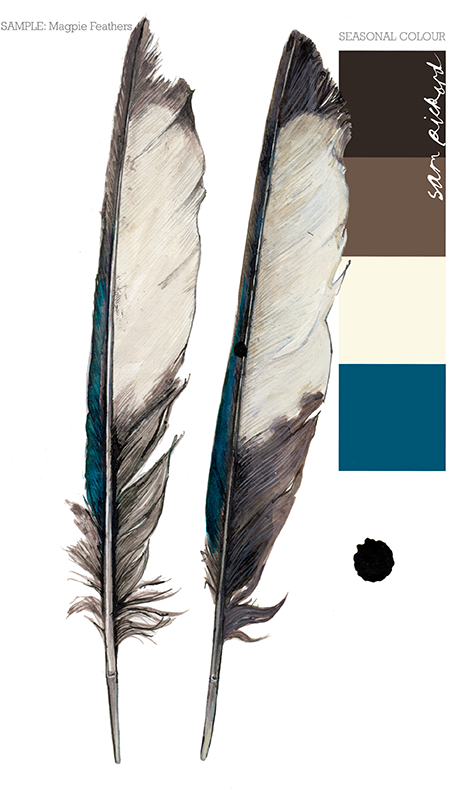
Colour from the Season - Magpie feather blue

Two for joy!

Magpies have been flying into my field of vision lately. First on a amazing vase exhibited at my open studios a month or so ago by ceramic artist, Jacqueline Leighton Boyce (see below). Then last week I found a single feather across my path, I'm superstitious about Magpies - is that one for sorrow I thought? but when it was followed by a similar feather in the same spot a week later, I decided, two for joy!

Colour wise I was astonished to discover an iridescent cyan blue edging the soft brown along one side of both feathers. I had to draw them because they were so marvellous.


The "Magpies" vase was too beautiful to part with. I love the fact that it has a Magpie on each side, therefore although one is hidden you know joy is just around the corner. It is without any doubt, one of my favourite things...
...from my seasonal colour sample notebook.

Tuesday, 30 June 2015

Screen - Printing - National Trust Cushions


Feels great to back in the studio after a fairly relentless few months of events, and I'm very happy because not only is the sun shining in heatwave proportions, but my Fawn and Rabbit cushions are to be part of the National Trust's Artisan and Craft collection, launching in their larger shops and on-line from September!!

So, today I started printing the first Fawn cushions onto natural linen, they will also have a Copper Beech foil printed as a background pattern to the Fawn, but the Fawn is printed first as it must be fixed at a higher temperature than the foil...

A concentrated start...

It's Rabbit's turn later...


Another hard day in the studio for Luna..!


Missing all the amazing colours that are blooming around everywhere at the moment, but I have ordered new paints, which is at least a step in the right direction.!


Tuesday, 26 May 2015

Colours from the Season - Rook feather black

Right in the middle of clearing one end of my studio to display work for Art Trek open studios last week, I was given a young dead Rook that had been killed on the road. Too big to be stored alongside the Thrush and Bullfinch currently in my freezer, I had to struggle to make time to sketch him but as always with drawing, I felt much the better for it.

A juvenile Rook looks a lot like a Carrion Crow, and so is difficult to identify, but the colour of the beak and shape of the head, suggests that this is a young Rook. Unexpectedly majestic close up; Victorian Gothic black plumage with iridescent purple highlights; dusty brown downy back feathers; slate grey beak and, on the sides and underside of the beak, slashes of pale pink...


Bank holiday sketching...


Right handed...


Photographed progress of the sketch.

If you happen to be in North Devon next weekend, please drop by my studio (looking fantastically tidy) and say hello! Second and final weekend for Art Trek open studios with Jacqueline Leighton Boyce, Judith Westcott and Mary Melling.

...from my seasonal colour sample notebook.

Sunday, 3 May 2015

Colour from the season - Swallow feather blue

The Swallow's journey back and forth between the U.K. and South Africa is miraculous, they arrive in April and May and usually depart in September, travelling 200 miles a day, maximum flight speed 35 mph! They are such an uplifting sight to see and herald the Summer, (as long as there's more than one of course).

Sadly this Swallow got trapped in a barn last Autumn and couldn't make the journey to it's winter home. Desiccated as he was in reality, I chose to paint him at peace and who knows, perhaps he's already flying in another life.

Such iridescence in that blue - truly extraordinary..!


pencil sketch...


paint before a touch of ink.


Many thanks to Judith for bringing him round for me to sketch, see her wonderful lino-cut prints here

...from my seasonal colour sample notebook.

Tuesday, 28 April 2015

Colour from the season - Tulip (Grand Perfection) Red

A more colourful notebook page than usual! inspired by the group of Tulips painted by Phillip Reinagle for 'The Temple of Flora' by Dr. Robert Thornton.


When, last week I spotted a pot of crimson striped tulips in the market, they made me think of this painting, and as I'm fortunate to have a full size facsimile of Dr. Thornton's book, I heaved it out to have a look.


Apparently Dr. Thornton bankrupted himself creating this book, known and prized primarily for its wonderful illustrations, it's also filled with poetry and exquisite hand flourished scripts. For further reading, there's a very good article about it with more illustrations on Dunbarton Oaks research library and collections blog here..

Far too large for a coffee table at over half a metre in height!

One of these days I hope to have a chance to draw a few additional stripey tulips to join the one above, meanwhile I'm in the middle of a Spring clean up of the studio in preparation for a screen -printing workshop at the end of the week, (necessary every time unfortunately as I'm pretty messy!)...

...from my seasonal colour sample notebook.

Thursday, 16 April 2015

Forty Seasons Scarves - Jay blue

Ten years have passed since I returned to art college to start an MA and stopped making the embossed velvet scarves that I'd become known for.

That's forty seasons!! 

To mark this momentous (to me) decade, I'm developing a new scarf collection! Very different from the last London inspired scarves, these will tell a story of some of the detail in the Exmoor landscape and its colours because that's what inspires and motivates me now. 

Over the past few weeks I've been exposing images onto screens, washing and ironing down clean backing cloths on my print table, mixing and sampling dyes, and this week, after several months of thinking about them, finally printing the first scarves. 

The colours of the first (three) scarves are inspired by the amazing colours of the Jay. Remember him? Soft pink browns, deep red brown, black, warm grey with a flash of electric blue. 


Mixing dye pastes is not dissimilar to baking a cake, in that once you've worked out the exact balance and quantities of the ingredients, you should in theory get perfect results every time, providing of course you use the same oven, or in the case of these Acid dyes, the steamer. My steamer is a very Heath Robinson affair, made from a Baby Burco and a welded tube of stainless steel, nevertheless after 45 minutes, it fixes the dyes perfectly...


Every scarf will be unique and have a different pattern/colour balance to the next, these first three are in the colours of the Jay, the next, well - I've a whole landscape of colours to choose from.

The first two scarves ready to wear..!


Last panel printed on the third scarf earlier in the studio today (with the unbelievably pesky rabbit hunting rascal of a dog Luna! (x)...


Special scarves, require beautiful fabric, so these are printed onto cashmere. I've been road testing the first sample I printed a few months ago and (until this recent amazing sunny spell) worn it every day, not exactly a hardship as it's the softest scarf I've ever owned...

(p.s. lovely article about my work and our workshops on the Devon Life Magazine website here )...

Friday, 20 March 2015

Colour from the season - Celandine Yellow

When the sun shines Celandine open their petals almost backwards to face it, I feel like this about Spring sunshine too so I have a fond affinity for Celandine and pleased to discover that it was also Wordsworth's favourite flower.

In Spring much of our garden is a spectacular carpet of this scruffy little yellow flower which is 100% uncontaminated yellow (matched to my eye) in my printed CMYK book...


After spending hours creating a design with Beech, Gorse and Heather (not at all bad), I discarded the idea and instead have given the Beech a solo focus as a large panel.

Printing in late afternoon yesterday, the sun streaming in and a Spring green colourway.

Printing the outline, and cleaning the squeegee before lifting the screen.


To satisfy an urge for some pattern in this print, today I added the repeat design created from notebook drawings (in brass). The Beech collection (cushions, runners and large wall panel) will be for sale in my shop fairly soon!


Happy first day of Spring..!

...from my seasonal colour sample notebook.