Tuesday, 23 October 2018

Botanical Greetings Cards

Finally I have had a moment to post about my Seasonal colour greetings cards which were printed in April..!


Each card features its unique colour palette from eight of the many plants and flowers I drew and documented here on my blog between 2010 and 2016.

I started this colour system in 2010 in order to move away from following global colour forecasting trends and instead start a more localised colour system to use in my own work and for the last two years I've translated many of these colours and images into dyes and hand printed textiles which I post as sampickard_textiles on Instagram.


It was incredibly hard to select just eight images out of so many I've drawn. In the end, I've chosen a few of my favourites! Read the original blog stories behind them by following the links below. Available to purchase in my online shop at http://sampickard.bigcartel.com/

Tea Rose - here
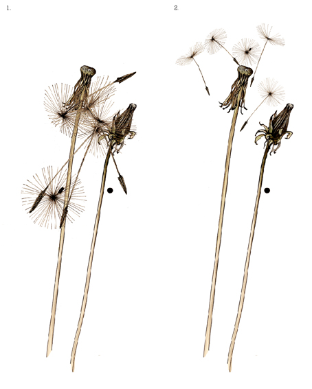
Dandelion - here
Marram grass - here
Pine cone - here

Spider Chrysanthemum - here
Sweet Pea - here
Gorse - here
Heather - here 

Thank you to those who have credited me when they have used my ideas as inspiration for their own work.

...from my seasonal colour sample notebook.

Monday, 13 August 2018

Poetry scarf - Ithaka

Earlier this year I found myself thinking about the possibility of printing the poem 'Ithaka' by Greek poet Constantine Cavafy onto a scarf. Ithaka is a wonderful poem which has inspired me since I was given a book of Cavafy's collected poems as a gift in 1984. Before starting an MA in 2005 I made a number of scarves with poetry on and this year it felt like the right time to make just one more.


I discovered that although Cavafy died in 1933, the copyright resided with one of the two surviving translators, Professor Edmund Keeley and so I wrote to him via Princeton University. At the time it felt like a shot in the dark, but to my great surprise and pleasure, Professor Keeley and Princeton University Press Permissions Department granted me a licence to print the poem onto a limited edition of up to twenty cashmere scarves.


The design and colours of the scarves are inspired by the poem and also the North Devon coastline where I live and work. I used an ink bottle pipette to write the poem so that it wasn't too even, and mono-printed a wavy sea slowly leading to a level horizon to underline the words of the poem.

I decided that although the scarf uses three screens, in this digital age of saturated colour overload, I would simply print each scarf in a single and unique shade of either blue or grey.


The condition of the licence is to give one scarf to Professor Keeley, and therefore I gave him first choice of the eleven scarves I've printed before posting them for sale on my website yesterday, (he chose number 9).


The copyright restrictions prevent me from publishing the poem here, but you can read it in full as well as an insightful description into the meaning of Ithaka written by Maria Gonzales De Leon by following the link below.

http://www.faena.com/aleph/articles/ithaka-a-poem-reminds-us-that-the-journey-is-more-important-than-the-destination%e2%80%a8/

To see the scarves and for more price, size, colour details, please visit my website at http://www.sampickard.co.uk/


from my seasonal colour sample notebook.

Monday, 31 July 2017

Colours from the season - Ginkgo Biloba green


It's been a while!

When I was teaching a short course in textile design at West Dean College last week, one of the students very kindly brought me in a small branch from her Ginkgo Biloba tree because I'd mentioned that I had always wanted to draw it. So there was nothing to be done but make time this weekend to draw a few leaves and document their beautiful colours for a bit of brain therapy...


Colours from the top: Leaf green; leaf stalk yellow; fruit green; young fruit blue/green; branch brown.

Many thanks to Sally

...from my seasonal colour sample notebook

Saturday, 8 July 2017

Back to the woods - Ivy

I've been waiting for an opportunity (with fair weather and free time coinciding) to photograph some of my work returned to the environment that inspired it and last week I had the chance to do just that.

Rather than going mad and trying to photograph absolutely everything, (and probably failing to get a decent shot of anything) I decided only to photograph two colour-ways of my Ivy Block fabric lengths. Therefore on a sunny afternoon last week we headed down to the woods with camera, tri-pod, fabric lengths, step-ladder and of course Luna to take a few photos.

Here are a few of the best.


They looked really at home...
I wasn't convinced that such a slender branch would hold them, but it did!


Green Ivy...


Luna mooched about doing her thing...


They look good indoors too.

Badgeworthy green...


Exford blue...


My favourite - Rockham red


These hand-printed linens are for sale on my website. Screen-printed to order, the lead times are approximately 4 weeks priced from £65.00 per metre.

The original Ivy colours from January 2013, proving that "mighty things from small beginnings grow" - John Dryden.

Original block repeat design of the Ivy block, with the first Chrysanthemum and Bamboo wall panels for 'Land, Sea, Sky' exhibition at the Devon Guild, June 2014


...from my seasonal colour sample notebook


Saturday, 27 May 2017

The Mount Haven Hotel, Marazion, Cornwall

Those who have followed my blog for a while have seen my large wall panel screen-prints develop, starting with the Chrysanthemum panel grown from a little plug plant in May 2012 (here), and the pen and ink sketch that inspired the panel and colours noted in November 2013 (here).

Earlier this year I had a wonderful commission to screen-print three of these panels for the Mount Haven Hotel, Marazion in Cornwall. The hotel has been recently taken over by the St. Aubyn Estates who wanted to introduce a new evolutionary design and colour scheme that would fit with the hotels long established reputation for comfort and relaxation. I met Lord and Lady St. Levan when they saw my stand at Cornwall Design Fair last year and they later visited my North Devon studio to see more of my work and select the designs, colours and fabric. The hotel is due to re-open on June 1st with the three panels framed and sited in the bar area of the hotel in front of a vast window overlooking St. Michaels Mount and the Cornish coast. Here I am in front of the finished Fern, Chrysanthemum and Beech panels before they headed off earlier this month.

It's lovely to think that my work will be on show in such an amazing hotel and seen by so many people! Some of the panel print developments are documented on my Instagram photos (here) and of course if you would like one of your own, the panels are available to commission either via my new web-site (here) or by contacting me directly through the contact link.

Friday, 19 May 2017

Marketing my way through 2017


Like many craftspeople I've had what's sometimes called a 'Portfolio career,' i.e. I've taken on part-time teaching, run workshops, licensed and sold my designs and illustrations to supplement my earnings as a craftsperson/maker. This year I decided to give my business a bit of an overhaul and improve the things I'm not very good at e.g. marketing, sales, branding, number crunching! and joined the Design Trust's 111 club in order to Dream, Plan, Do and the emphasis is very much on the do!

As a 21st business birthday present, I decided to have some 1-2-1 sessions with Patricia Van den Akker who runs the Design Trust in the UK. As a result, I've worked hard and made some progress, I have a new website and shop (www.sampickard.co.uk), I have a clearer understanding of what my brand is (or will be), I know what motivates me and what I'm most passionate about, but I'm finding it difficult to fit it all in, and create new work and do all the fairs and cope with all the other things life has a habit of throwing at you!

This is why my blog and drawing have taken a back seat as behind this silent exterior I'm working harder than ever. (I've also realised that I find marketing my work really difficult as my work is very much a part of who I am, and my creative self esteem is, even after 21 years in business, still easily dented).

Of the many things I've achieved this year so far, the creative highlight was printing my own lengths of fabric. The Ivy Block I designed in 2014, as a block and screen repeat, but then sent it off to a manufacturer who printed it on a digital printer. You might wonder what the difference is between a commercially/digitally printed length of fabric and a studio-printed length of fabric? In the end the difference is far beyond the look of the print, or it's commercial viability, it's the level of satisfaction of doing something you were trained for which in my case was thirty five years ago at Camberwell Art College, and although the big fabric manufacturers dominate the textile industry, I believe there is still a place however small, for fabric that's printed on an Arts and Crafts scale.

Here are the first images of the Ivy Block design being sampled and printed in my studio. I'll be exhibiting these fabrics at West Dean Arts and Crafts Festival from 2nd-4th June and at The Contemporary Crafts Festival, Bovey Tracey 9th - 11th June. Well worth a visit if you can make either of them, and I'd love to talk you through the print process if you do.

First colour sampling...


Blue Ivy detail...


Imagine such a colourful woodland!...


Printing the first length, for my living room - Arts & Crafts inspired colours...


"Have nothing in your house that you do not know to be useful or believe to be beautiful"
William Morris


Sunday, 15 January 2017

Colour Stories 2017


My year so far has been mainly in the print studio developing colour stories selected from a few of the many hundreds of colours I've documented over the past 5 years (hurray!!!). I feel so excited about the latest development in this journey that's gone from flora/fauna, to colour, to sketch, and now lastly to print. A body of work informed by the colours I've collected and noted from the North Devon landscape, my garden, other peoples gardens! Every colour reminding me of times past, people I've loved and days out and about with our lovely dogs.

Here are the first two colour stories...

The first colour story is from my daily walk with Luna. Brambles, ferns and perturbed pheasants as I scramble through the banks looking for her!

Once I had decided on the colours, they were then developed and recorded as Reactive Dye recipes so that I will be able to re-produce the colours over and over. This takes time, carefully adjusting the dyes and colour balance, allowing for the underlying grey tone of the natural linen, until I'm completely happy with the colour and feel its the best that can be achieved.


The second colour story is from the sand dunes. Club Rush, Marram Grass and Magpie feathers, all from the extensive dune systems in North Devon. Subtle, sandy, coastal. Working from the principle that the colours from the landscape will be as harmonious and uplifting to look at and live with inside as they are out. 


I may mix and match these colours i.e. not only work with them in their individual colour stories, but the really important thing is - that the colours above are now translated into dye recipes and therefore onto my textiles!!

I'm recently using Instagram to show more of my print and product developments, find me  @sampickard_textiles

Friday, 14 October 2016

Screen Printing in the studio Fern collection

Drawing isn't work for me, even though it is of course an important part of my work, it's also how I unwind and relax. Rather than pick up a book in the evening or watch TV, over the past ten years years often I've preferred to draw. It gives me a huge input of inspiration, as well as original imagery to use in my designs...

...or that's until this year, when my days have been so full on and labour intensive I haven't had any spare energy or even inclination, and drawing in the evening has been squeezed out! (I have at times wondered if I will ever draw again, but let's not head off down that train of thought!).

It's not all doom and gloom however as some of those sparks of an idea I've had whilst drawing have filtered into new textile designs. In particular a new Fern panel, as well as Fern cushions and napkins have hit the print table. They were a great success when I exhibited them last week at 'Handmade at Kew' and I thought I'd share some images here...(as I'm not drawing!)

Super size ferns drying on the print table..


With Luna! (she was not overly keen to pose, but she does give a sense of scale!).
Ivy fabric in the background...


With a fellow panel...

Two by two napkins drying on the rack...
Folded Fern napkins with Beech and a few Rabbits, not unlike the woods here in North Devon...
All now available from my website shop! 

I've just joined the 111 club set up by Patricia Van den Akker of the Design Trust. In 2017, I intend to take time, along with one hundred and ten other creatives (internationally), to properly reflect on and make informed choices about running my business in 2017! and thereby (hopefully) make more time for the things that matter most.

If it's of interest to you there may be a few places left  - find out more about it here ...

Thursday, 22 September 2016

Monterey Cone journey's around the world with Ã…ry

It has been a very exciting Autumn for my Monterey Cone, which has headed off in various re- designed forms, from its home here on the edge of Exmoor in North Devon, on a journey, not only to regions of the British Isles, but to the far corners of the world as well. Who knows it may well eventually find its way to Monterey!

Firstly this year I was asked by the Swedish company Ã…ry to design a new tray collection. They liked my Monterey Cone cushion, but wanted me to design something exclusively for them. I scaled down the cone, added some pine needles, then introduced a change of scale by including some branches and cones of the Larch. Thinking that a few rare Heath Fritillary butterflies may well have visited my cone in the Heddon valley, I added these in as well.


It's not possible to print metallics onto these beautiful birch wood trays, so I decided to recreate a metallic feel to the design, keeping the look of the copper/bronze tones of the printed cushion. Getting the exact colour balance was painstakingly slow, printing many sample colours in order to achieve exactly the right tones.


When you're working on a project like this, it can seem a long time before you see the product, or even share any images. The final trays and table mats were launched this Autumn by Ã…ry at Formex in Stockholm, then Maison et Objet in Paris and are even better that I'd hoped. I was so pleased and delighted to see them when Ã…ry sent me a photo from their stand a few weeks ago. Now that I have some samples of my own, I thought I'd write about them...

Table mats and coasters...


Moorland co-ordinates (!) with my new hand printed Beech napkins...


I'm reminded of the fact that I drew the Monterey cone after I found it on the ground after a storm in the Heddon Valley on Exmoor, and it has brought so much inspiration to me as well as others.

...and if that wasn't enough, the Monterey Cone cushion is exclusively part of the National Trust's Artisan and Craft Autumn collection, in some of the larger shops and available online here!


I'm exhibiting at Handmade at Kew, in the world famous Royal Botanical Gardens, from 6th - 9th October. I have a few Private View invites left for the evening of the 5th October, if you would like to come, please email me with your postal address and I'll be happy to send one to you (while still available)!

...from my seasonal colour sample notebook.

Sunday, 28 August 2016

Colour from the season - Hard Fern green

As a self-employed designer/maker,  I'm pretty disciplined on the whole. I rise early, walk Luna and start work by 9am. I usually work until 6pm, but sometimes later. I also often work on Saturday and if I'm running a screen-printing or Photoshop workshop, I work all weekend. The plus side is of course that I love my work and as long as I don't beat myself up for not getting something done, in the main, no-one else does either.

These attractive little ferns, which grow everywhere here in North Devon are called Hard Ferns or Blechnum spicant (slightly strange name so called because of their leathery form (?)). I've made time to sketch a few of them, to feature in a new wall panel along with a couple of other ferns, which I hope to put on screen and print at a super-sized scale next week.

I generally design what I would love to live with myself. As Oscar Wilde so aptly said -
"Be yourself; everyone else is already taken"...


In case you wonder what soft ferns look like? I'm attaching a photo of a Soft Shield Fern (Polystichum setiferum) below...


...from my seasonal colour sample notebook.

Monday, 4 July 2016

Old House New Home - amazing blind!

It's been a year full of new challenges..!

In February, I had a very interesting phone call from the television company, Amazing Productions. They were working on a fab new home makeover show called 'Old House, New Home' for Channel 4, currently showing in the UK (here), and asked if George Clarke, architect and presenter, could help me print something in my studio as a surprise present to the homeowner, Emily. 

Here's George in my studio!!! 


After working out what might be feasible in the time frame, we decided that I would design a blind that George and I would screen-print. The design was to be inspired by fragments of an old 1950's wallpaper that had been in Emily's bathroom. The wallpaper would have to go during the renovation and my new design would be an updated contemporary reference to it. 


I only had a very short time span for this, but enjoyed the whole project immensely -
Here's a few extra images; printing with George; from my sketchpad; and of the blind on the print table...

Always amazing...printing!


happy printers...


The two options on the colourway were fuschia pink and silver along with a green and grey which matched the floor tiles and walls in the bathroom.  Here's the pink in my sketchbook, but after sampling, the silver was selected...


Raw linen, chartreuse, charcoal grey and silver...


upside down on my print table...


and of course the final made-up blind in Emily's house..! 


Special thanks to the fantastic production team at Amazing Productions!
It was really lovely to meet George, also Emily, and the blind was beautifully sewn up by Julia at Finishing Touches' in South Molton.

Links...


We are running a new Photoshop to Screen-Printing short course in my studio in September, also a "Photoshop for Textiles" short course at West Dean College this Autumn. More Autumn Screen printing and Photoshop for Textiles workshop dates to be finalised soon...

http://westdean.assets.d3r.com/pdfs/original/13622-short-courses-2016-17-low-res-pdf.pdf


Sunday, 8 May 2016

Colour from the season - Black Lace Elder - black


As an alternative to "a drawing a day" (which frankly for me is unachievable for one reason or another much of the time), you might like my motivational phrase to myself at the moment - "one leaf at a time."

So yesterday, in order to keep my colour notebook going, (which primarily of course I keep as my own colour and image resource, and inspiration), I decided to draw something simple, just an outline drawing. If all I can manage to sketch is a leaf, then find a leaf that I feel inclined to draw and enjoy drawing it!

Here are the wonderful colours I noted in this Black Lace Elder leaf. An intricate dark red purple leaf, the underside is a very French grey green with deep pink veins throughout. It's woody branches are a pale dry brown and the flowers themselves will be a foam of Champagne pink.

Not quite in flower in my garden - here's the outline pen and ink drawing, alongside it's gorgeous colours..!


...from my seasonal colour sample notebook.

Monday, 25 April 2016

Screen Printing in the studio - Gorse


Gorse, in all it's yellow spiky splendour, is out in full bloom on the heath and lanes around Exmoor right now. It flowers all year round of course, but has it's real moment of madness in April and May. What I love most about Gorse is the mixed messages of sweet coconut fragrance from the pea flowers, alongside it's dangerously resilient thorns, and I've tried to capture something of this in my design.

This print for a wall panel has taken over a year from initial drawings and concept, to finally getting onto screen and printed. Maybe the best things in life do sometimes take a bit longer to reach fruition?

Here's the first panel being printed in my studio last week...

Very very dark green..!

Ouch..!


I'll be exhibiting the Gorse at these Fairs in 2016:

Tuesday, 2 February 2016

Spring Cushions for the National Trust


As fresh as February's temperatures, slate grey and white screen-printed onto unbleached linen, my new Spring cushions have sprung into the National Trust shops and online, featuring some of my favourite flora from my seasonal notebooks.

Exclusive to the National Trust's Artisan and Craft collection, you can claim one (or two) of these limited edition lovelies in their online shop here...


Sunday, 24 January 2016

Forty Season Scarves cont...


When I noticed the Jay at the side of the road in 2012 on our way back from Cornwall (here) I would never have guessed that his colours would be the start of a new scarf collection but I've always found that as long as I take the first step, there's always the probability it will lead to the next.

I'm very pleased that they've been such a success, not least because I so enjoy printing them. At last I've had a chance to print a few to go on sale in my online shop (here). Every one is an individual having its own unique character, pattern and colour balance (just like people really!). The scarf you'll see in the image on the shop is the scarf you can uniquely own.


Printing in the studio with Luna on the alert and a Swallow scarf...

...from my seasonal colour sample notebook.