A few months ago I stopped drawing (which felt very strange) and took time to reflect on the past three and a half years of documenting colours in plants, birds, shells etc. and writing about them on my blog.
As far as possible I ignored the pre-conceptions that I'd had about what should be the outcome, and also what I thought others might think about it, I just did whatever I felt most enthusiastic about and let it develop. When I worried that I should have chosen brighter or more varied plants and colours, I accepted that I've always been attracted by simple forms and more muted tones, that this journey has never been about fashion or trends anyway (quite the opposite in fact), that it may or may not be the most creative conclusions I'd ever come to but it would be whatever it would be!
I'm very happy with the outcome :)
Yesterday dawned bright and sunny, so an opportunity to take some studio shots of the finished screen prints, The sun came in and out of the clouds but I did get a few images if a bit dark, here they are...
And then there were three...
Spider Chrysanth and Bamboo (72" x 32") - a plant in your room which you don't have to water!
Screen-printed onto natural linen, Bamboo and Ivy...
My favourite - a deep purple Ivy screen printed block repeat!
Emptied a pot from the garden to take this photo - made me smile!
In reality the colours of these prints are subtle and beautiful...
...and today, drying on my print table - a special edition of the Twine table runner in two of the amazing colours of Stauntonia Hexaphylla (leaf green coupled with flower pink)..!
On Tuesday, I'll be delivering this work to the Devon Guild of Craftsmen in Bovey Tracey, as part of 'Land, Sea, Sky' exhibition! It does feel like an end as well as a new beginning somehow. (though I hope to still post occasional colours and plants which inspire me!).
I hope you can make it to the exhibition, but if you can't, you might like to know that I'll also be showing these at Cornwall Design Fair (August 15th - 17th).
I should add that they are of course all for sale! please email me if you'd like information and prices.
(Many of my early notebook sketches were drawn spending time with my dad before he died just over two years ago and looking through them has been coloured with memories. I'd been on the edge of starting print workshops in my studio, just before he died and now with the invaluable support of
Womens Development Unlimited , I'm very excited that from October, I hope to at last be starting these, and teaching people who'd like to learn to design, print and dye textiles - in fact all the things I love doing myself...watch this space!).
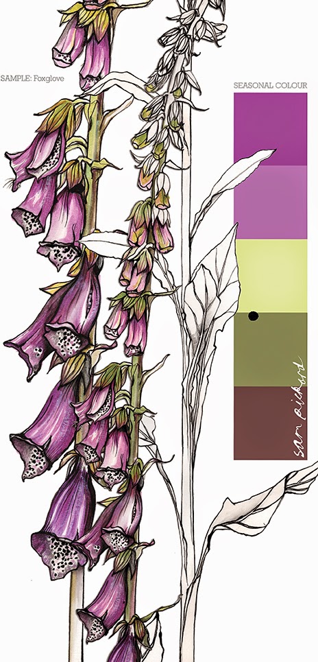
...from my seasonal colour sample notebook.


.jpg)