Tuesday, 30 June 2015

Screen - Printing - National Trust Cushions


Feels great to back in the studio after a fairly relentless few months of events, and I'm very happy because not only is the sun shining in heatwave proportions, but my Fawn and Rabbit cushions are to be part of the National Trust's Artisan and Craft collection, launching in their larger shops and on-line from September!!

So, today I started printing the first Fawn cushions onto natural linen, they will also have a Copper Beech foil printed as a background pattern to the Fawn, but the Fawn is printed first as it must be fixed at a higher temperature than the foil...

A concentrated start...

It's Rabbit's turn later...


Another hard day in the studio for Luna..!


Missing all the amazing colours that are blooming around everywhere at the moment, but I have ordered new paints, which is at least a step in the right direction.!


Tuesday, 26 May 2015

Colours from the Season - Rook feather black

Right in the middle of clearing one end of my studio to display work for Art Trek open studios last week, I was given a young dead Rook that had been killed on the road. Too big to be stored alongside the Thrush and Bullfinch currently in my freezer, I had to struggle to make time to sketch him but as always with drawing, I felt much the better for it.

A juvenile Rook looks a lot like a Carrion Crow, and so is difficult to identify, but the colour of the beak and shape of the head, suggests that this is a young Rook. Unexpectedly majestic close up; Victorian Gothic black plumage with iridescent purple highlights; dusty brown downy back feathers; slate grey beak and, on the sides and underside of the beak, slashes of pale pink...


Bank holiday sketching...


Right handed...


Photographed progress of the sketch.

If you happen to be in North Devon next weekend, please drop by my studio (looking fantastically tidy) and say hello! Second and final weekend for Art Trek open studios with Jacqueline Leighton Boyce, Judith Westcott and Mary Melling.

...from my seasonal colour sample notebook.

Sunday, 3 May 2015

Colour from the season - Swallow feather blue

The Swallow's journey back and forth between the U.K. and South Africa is miraculous, they arrive in April and May and usually depart in September, travelling 200 miles a day, maximum flight speed 35 mph! They are such an uplifting sight to see and herald the Summer, (as long as there's more than one of course).

Sadly this Swallow got trapped in a barn last Autumn and couldn't make the journey to it's winter home. Desiccated as he was in reality, I chose to paint him at peace and who knows, perhaps he's already flying in another life.

Such iridescence in that blue - truly extraordinary..!


pencil sketch...


paint before a touch of ink.


Many thanks to Judith for bringing him round for me to sketch, see her wonderful lino-cut prints here

...from my seasonal colour sample notebook.

Tuesday, 28 April 2015

Colour from the season - Tulip (Grand Perfection) Red

A more colourful notebook page than usual! inspired by the group of Tulips painted by Phillip Reinagle for 'The Temple of Flora' by Dr. Robert Thornton.


When, last week I spotted a pot of crimson striped tulips in the market, they made me think of this painting, and as I'm fortunate to have a full size facsimile of Dr. Thornton's book, I heaved it out to have a look.


Apparently Dr. Thornton bankrupted himself creating this book, known and prized primarily for its wonderful illustrations, it's also filled with poetry and exquisite hand flourished scripts. For further reading, there's a very good article about it with more illustrations on Dunbarton Oaks research library and collections blog here..

Far too large for a coffee table at over half a metre in height!

One of these days I hope to have a chance to draw a few additional stripey tulips to join the one above, meanwhile I'm in the middle of a Spring clean up of the studio in preparation for a screen -printing workshop at the end of the week, (necessary every time unfortunately as I'm pretty messy!)...

...from my seasonal colour sample notebook.

Thursday, 16 April 2015

Forty Seasons Scarves - Jay blue

Ten years have passed since I returned to art college to start an MA and stopped making the embossed velvet scarves that I'd become known for.

That's forty seasons!! 

To mark this momentous (to me) decade, I'm developing a new scarf collection! Very different from the last London inspired scarves, these will tell a story of some of the detail in the Exmoor landscape and its colours because that's what inspires and motivates me now. 

Over the past few weeks I've been exposing images onto screens, washing and ironing down clean backing cloths on my print table, mixing and sampling dyes, and this week, after several months of thinking about them, finally printing the first scarves. 

The colours of the first (three) scarves are inspired by the amazing colours of the Jay. Remember him? Soft pink browns, deep red brown, black, warm grey with a flash of electric blue. 


Mixing dye pastes is not dissimilar to baking a cake, in that once you've worked out the exact balance and quantities of the ingredients, you should in theory get perfect results every time, providing of course you use the same oven, or in the case of these Acid dyes, the steamer. My steamer is a very Heath Robinson affair, made from a Baby Burco and a welded tube of stainless steel, nevertheless after 45 minutes, it fixes the dyes perfectly...


Every scarf will be unique and have a different pattern/colour balance to the next, these first three are in the colours of the Jay, the next, well - I've a whole landscape of colours to choose from.

The first two scarves ready to wear..!


Last panel printed on the third scarf earlier in the studio today (with the unbelievably pesky rabbit hunting rascal of a dog Luna! (x)...


Special scarves, require beautiful fabric, so these are printed onto cashmere. I've been road testing the first sample I printed a few months ago and (until this recent amazing sunny spell) worn it every day, not exactly a hardship as it's the softest scarf I've ever owned...

(p.s. lovely article about my work and our workshops on the Devon Life Magazine website here )...

Friday, 20 March 2015

Colour from the season - Celandine Yellow

When the sun shines Celandine open their petals almost backwards to face it, I feel like this about Spring sunshine too so I have a fond affinity for Celandine and pleased to discover that it was also Wordsworth's favourite flower.

In Spring much of our garden is a spectacular carpet of this scruffy little yellow flower which is 100% uncontaminated yellow (matched to my eye) in my printed CMYK book...


After spending hours creating a design with Beech, Gorse and Heather (not at all bad), I discarded the idea and instead have given the Beech a solo focus as a large panel.

Printing in late afternoon yesterday, the sun streaming in and a Spring green colourway.

Printing the outline, and cleaning the squeegee before lifting the screen.


To satisfy an urge for some pattern in this print, today I added the repeat design created from notebook drawings (in brass). The Beech collection (cushions, runners and large wall panel) will be for sale in my shop fairly soon!


Happy first day of Spring..!

...from my seasonal colour sample notebook.

Wednesday, 25 February 2015

Colour from the season - Blackthorn grey (plus Exhibition News)


Aware that I haven't put pen to paper for quite some time, yesterday on my regular morning tramp with Luna, I peered out from my waterproofs into the horizontal hail and biting wind to see if there was anything, a single branch, a leaf, a dull or colourful something, anything, that I felt enthused to draw (it is February after all!). Look what I noticed, isn't it amazing!? I thought so, a natural barbed wire (ouch!).

Actually grey, just in case you hadn't already heard, is 2015's new black. It's not just clothes, but hair, walls, and there's a seasonal abundance of it here in Devon. Combined here (as it was on the branch) with Scarred Blackthorn red, (think Pantone colour of the year Marsala??) it's right on trend. Top tip... If you paint Farrow and Ball's 'Dove Tale' with a slash of 'Brinjal', you'd have a room not far off the fabulous warm colours of a Blackthorn branch...


I love this fine porcelain vase, perfect for such a Blackthorn branch, by Gilda Westermann...

Some early dates for 2015 fairs and events where I'll be exhibiting my textiles:


Art Trek Open Studios - North Devon, May 23rd/24th and 29th/30th.


More to follow later in the year…

…from my seasonal colour sample notebook.

Thursday, 22 January 2015

Exmoor inspiration

These cushions are taking up residence in upstate New York, Lucky things!!! (and yes I do feel a bit envious!). Moorland Rabbit led the way in October last year and now Moorland Fawn and Pheasant are heading over to join him which is just perfect.
They are my nostalgic take on the 1960's - Reminiscent of reading Enid Blyton, riding in Morris Travellers and drinking lashings of Tizer! I screen-print every one (front and back) and so they are all unique. I've become really fond of them all, but especially in these colours.


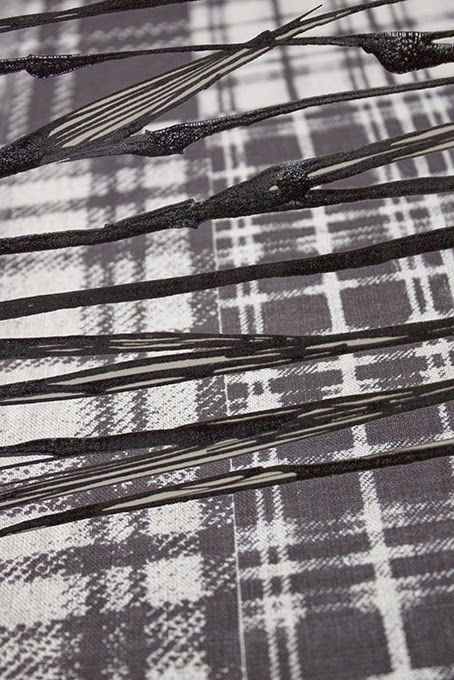
In much the same vein I've been revisiting favourite Moorland plant drawings and capturing the essence of them in loose inky plant drawings. Here I've overlaid them onto a monochrome version of the tartan backgrounds from the cushion prints - it's just the starting point for a new scarf collection (but which I expect to be in full moorland colour!).

Heather...


Gorse...


Marram Grass...


Excited because our first Photoshop workshop starts tomorrow.


...from my seasonal colour sample notebook.

Wednesday, 14 January 2015

Colour from the season - Club Rush Brown

I nearly didn't post these - my walking companion (Pete) thought these Club Rushes too dull to bother with, and you may agree with him!

In their defence, their flower heads catching the faint sunshine were like little orange beacons glowing. Maybe I have a serious case of wearing rose tinted specs here, but they were one of the most colourful plants in the dunes at the North Devon Coast last weekend and I thought them worth a mention. Pah who needs show off tropical colour and glorious sunshine anyway! - think Harris Tweed... 


...from my seasonal colour sample notebook.

Tuesday, 6 January 2015

Colour from the season - Sinecio Silver


A belated welcome to 2015!

Although it's slowed a little, I am as inspired by seasonal colour as I was when I started this journey in 2010, documenting the colours I found in flora and fauna. Like a slow revolution it affects my design work and uplifts my life.

This elegant plant, although only a half hardy garden perennial and so not built to withstand icy weather, nonetheless perfectly captures the colour and mood of a frosty January morning.

Sinecio cineraria, aka Silver Dust wears a felted coat of the palest silvery grey and patches of an unexpectedly vibrant green where the frost has bitten it. I found a pile of them dumped in the woodland a few months ago and so transplanted a few to my garden!


...from my seasonal colour sample notebook.

Monday, 22 December 2014

Posy - Ivy, Pine, Mistletoe


Seasons Greetings!

It's easy to get caught up with life and imagine that everything is going along ok for friends and family you haven't been in touch with for a while. This seasonal posy is for those who are having a difficult time this Christmas, with lots of love...


Very Happy Christmas and New Year 2015 - where does the time go?!

Tuesday, 16 December 2014

Screen-printing - Budgie Chrysanth Bespoke

It's a relief when a custom print is successful. It requires attention to detail as mistakes are expensive, both in terms of time and wasted fabric. I've just printed this Budgie Chrysanth panel (in fact it's still drying on the print table). Hard to see in these images taken in artificial light but it is pretty damn perfect! 


The customer saw my work earlier in the year at Selvedge Fair and phoned to ask if I could print a fabric panel to hang on the wall of her new kitchen, matching the colours in her blind (a Sanderson fabric (left)). Here's the printed colour swatch I sent her...


Once the colour was okayed, I sample printed to check number of squeegee pulls as this can vary hugely depending on the dye, type and weight of fabric etc. Very glad I did this, if I'd guessed I think I would have got it wrong...


There are fine details in areas of this design. Too many pulls with the squeegee, and the white of the Budgies eyes will fill in, however not enough pulls and other areas will not have enough print coverage, so it's tricky and had to be just right... 


Learning to stay away from my feet when I'm printing - Luna...


Monday, 8 December 2014

Screen-printing - Beech Table Runners

I've always believed you must design the things you like yourself (as far as possible) and would want to live with. I've never cared too much about fashion, my home style is a fairly eclectic mix of things I love, and things I don't have the discipline to get rid of! However the longer I live here, on the edge of Exmoor and the North Devon coast, inevitably the more it infiltrates my designs, the colours I'm using, and choice of materials.

I'm planning to print a large panel of the Beech as I think it will be uplifting to have branches of Beech inside my home (in fact i've always fancied living in a tree house), however in the meantime when asked to create some work for an exhibition, I decided to re-design the Beech for cushions (previously posted) and also a runner.

A two colour screen print - black outline and infil colour...


In the studio today - if the photo looks a bit overcast that's because the day was!


The (seasonal) leaf colours range here from late Autumn on Exmoor in the rain, through to Winter bleached out and frosted. I love all these colours but the darker Autumn brown is my favourite (and was a nightmare to achieve!).


Packed these up in a brief ray of sunshine last week.


In Springtime, I'll print Beech green.

In my online shop soon or email me.

Wednesday, 3 December 2014

Colour from the Season - Great Spotted Woodpecker red

The last two months have been busy, I've worked almost every day including weekends yet I have still fallen behind with deadlines, which is unusual. Honestly, I think I've been quite sad and maybe this has been the incentive to finally draw this beautiful Great Spotted Woodpecker that a friend gave me earlier this year (he's been in the freezer).

I drew two sketches, I liked aspects of both, the wings and feet of the first and the head of the second (below). The feathers are mainly soft neutrals, contrasting black and white spot patterned, and a dramatic red crown - I thought Constructivist colours...


The first sketch...


(spilled the ink)

and in every rare spare moment - I've been training Luna..!


'My Head is an Animal' by Of Monsters and Men (2011) is what I'm playing to death at the moment. This one's 'Slow and Steady'...


...from my seasonal colour sample notebook

Wednesday, 19 November 2014

Hope Bourne Inspiration and Copper Beech

Last week I saw a film by the photographer Chris Chapman about the life of Hope Bourne, a gifted artist and writer who lived an extraordinary life on Exmoor. Her philosophy and take on life was both moving and uplifting... 

“Money as such is a useful invention, making commerce possible beyond the state of barter. A moderate amount is necessary to us all - but consider: of all the things you buy, that which you buy dearest of all is money. For money you sell the hours, the days of your life, which are the only true wealth you have. You sell the sunshine, the dawn and the dusk , the moon and the stars, the wind and the rain, the green fields and the flowers, the rivers and the sweet fresh air. You sell health and joy and freedom” 

― Hope L. Bourne

I've been selling the hours printing cushions. I wondered if Beech leaves, bronze foil and raw linen would be a interesting combination to evoke a sense of Copper Beech..?


I've had two lovely Q & A blog features about my work recently :

The first by Stacey Sheppard on her fab Interiors/design blog 'Design Sheppard' here

The second by Country Homes and Interiors on their Country Days Blog here


Friday, 7 November 2014

Colour from the Season - Owl Feather brown

I was given some feathers from a Tawny Owl some time ago (also a Woodpecker), however this is the first moment that I've felt in quite the right mood to draw them!

Serrated and fringed wing feathers and fluffy down feathers, make the Owls flight almost silent. The colours themselves are also quietly beautiful - late Autumnal maybe?


Being without Chip was like life without colour, so last week I decided to look for a dog who was needing a home - and Luna moved in on Monday...


"There is always something left to love"

(Gabriel Garcia Marques,
100 Years of Solitude)