Saturday, 14 June 2014

Colour from the season - Sea Pink pink

Sea Pinks - also known as Thrift or Armeria Maritima are part of the the sensory palette making up the rugged cliff paths here in North Devon. Delicate, slightly bleached out colours from June's radiant sunshine and salty air, yet tough enough to withstand the shock of the most bitter coastal storms ~ exquisite..!


Wishing you a colourful weekend!

...from my seasonal colour sample notebook.

Tuesday, 3 June 2014

Colour from the Season - Stinging Nettle Green


Four weeks ago I began a course in Mindfulness. One thing we've been encouraged to do is study everything more intensely - expanding what is often a very ordinary experience into something extraordinary. This sense, the visual, is easy for me, not only is this something I do without effort all the time, but something I've spent much of my life striving to be good at.  This is described perfectly by John Hopper when coincidently last week he wrote about Mindfulness, Creativity and Observation on 'The Textile Blog' (here).

I was reminded how beneficial it is to draw and how not drawing these past few months has been negatively affecting me, as though some part of me were missing - like losing touch with an old friend.

The (vicious) dewy hairs of these Stinging Nettles (Urtica dioica) in the early morning were the palest misty purple, once picked they dramatically wilted and I thought that was the end of them. They revived however, now more an angry shade of red and my hands are still smarting...


"Tender handed stroke a nettle,
And it stings you for your pains:
Grasp it like a man of mettle,
And it soft as silk remains"

Aaron Hill, 1753 (British dramatist and poet)

(Try this if you like but don't say I didn't warn you!)

...from my seasonal colour sample notebook.

Saturday, 17 May 2014

The little things - Robin Redbreast

The little things in life that make the difference...


...Roy introducing me to his friend in the local woodland (location and inspiration for so many notebook sketches on my blog) - amazing lovely and amazing (!!) and well it certainly made my day today, (thanks Roy!).

Eye contact...


Saturday, 10 May 2014

"Don't push the river, it will flow by itself" (Chinese proverb)


A few months ago I stopped drawing (which felt very strange) and took time to reflect on the past three and a half years of documenting colours in plants, birds, shells etc. and writing about them on my blog.

As far as possible I ignored the pre-conceptions that I'd had about what should be the outcome, and also what I thought others might think about it, I just did whatever I felt most enthusiastic about and let it develop. When I worried that I should have chosen brighter or more varied plants and colours, I accepted that I've always been attracted by simple forms and more muted tones, that this journey has never been about fashion or trends anyway (quite the opposite in fact), that it may or may not be the most creative conclusions I'd ever come to but it would be whatever it would be!

I'm very happy with the outcome :)

Yesterday dawned bright and sunny, so an opportunity to take some studio shots of the finished screen prints, The sun came in and out of the clouds but I did get a few images if a bit dark, here they are...

And then there were three...


Spider Chrysanth and Bamboo (72" x 32") - a plant in your room which you don't have to water!


Screen-printed onto natural linen, Bamboo and Ivy...


My favourite - a deep purple Ivy screen printed block repeat!


Emptied a pot from the garden to take this photo - made me smile!


In reality the colours of these prints are subtle and beautiful...

...and today, drying on my print table - a special edition of the Twine table runner in two of the amazing colours of Stauntonia Hexaphylla (leaf green coupled with flower pink)..!


On Tuesday, I'll be delivering this work to the Devon Guild of Craftsmen in Bovey Tracey, as part of 'Land, Sea, Sky' exhibition! It does feel like an end as well as a new beginning somehow. (though I hope to still post occasional colours and plants which inspire me!).


I hope you can make it to the exhibition, but if you can't, you might like to know that I'll also be showing these at Cornwall Design Fair (August 15th - 17th).

I should add that they are of course all for sale! please email me if you'd like information and prices.

(Many of my early notebook sketches were drawn spending time with my dad before he died just over two years ago and looking through them has been coloured with memories. I'd been on the edge of starting print workshops in my studio, just before he died and now with the invaluable support of Womens Development Unlimited , I'm very excited that from October, I hope to at last be starting these, and teaching people who'd like to learn to design, print and dye textiles - in fact all the things I love doing myself...watch this space!).

...from my seasonal colour sample notebook.

Tuesday, 6 May 2014

It's my birthday and I'll print if I want to!


First (paper) test printing of the Bamboo, lunch with a lovely friend, special scarf - perfect day!!!


must be time for a glass of Prosecco - Cheers! x

...from my seasonal colour sample notebook.

Sunday, 27 April 2014

Postcards

Selecting just twenty-five favourite images from my notebook pages to exhibit during the Land Sea Sky exhibition is proving difficult, but having to choose just six as postcards has been ridiculously hard! In the end I ran out of time and couldn't faff about any longer. In no particular order here they are...


First: Monterey Cone's remarkable popularity continues, 10,651 page views at this moment. While I do like it - I'm not sure it especially warrants this kind of attention (but I did include it!).

Second: Old Tea Rose. I like this for the drawing as well as the colours. It's discovery on such a cold February day, gave me such immense pleasure and I think I captured something of this in the drawing (which is always astonishing).

Third: Sunflower. "Are there any flowers more full of Summer's sunshine" is what I wrote about this last year in France. I may have even had a glass of wine in my hand at the time...need I say more?!

Fourth: Spider Chrysanthemum. I drew this straight off in pen and ink without sketching which required intense concentration. Now it's screen-printed at a scale of 1.83 metres! It reminds me of my son Josse and feels like only yesterday it/he was only a little plug plant!(x)

Fifth: Bamboo. Elegant, rustles in the wind, reminds me of Sikkim and also 100%Design. Probably one of the most difficult plants I have ever drawn and I really really want a large screen print of it in my living room!

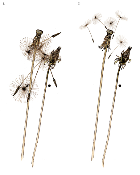
Sixth: Dandelion Seed head - Because I am in love with clocks, watches and therefore of course Dandelions!


...from my Seasonal colour sample notebook. 

Sunday, 30 March 2014

Posy - Pussy Willow, Cherry Blossom, Moss...

Happy Mothers Day..!

This is the posy I gave to my wonderful mum today...


...from my seasonal colour sample notebook XXX


Sunday, 16 March 2014

Selvedge Spring Fair

I'm delighted to be exhibiting in a few weeks at Selvedge magazine's Spring Fair in Chelsea Town Hall, London on 4th and 5th of April !!!


I'll be showing a Spring Fair edition of the Spider Chrysanth wall panel!
not to mention a few familiar faces...
Hope to see you there!! 
For more information go to Selvedge Magazine.

!!STOP PRESS!! 

I have a few free tickets to give away - so if you're interested in visiting, please email me at sam@sampickard.co.uk ASAP!

Monday, 10 March 2014

Colour from the season - Winter Yellows!!

Two sunny days in a row here in North Devon! I've been decorating, painting walls not paper but I did update a few yellows from past notebook pages (February/March) and thought I'd share their cheery colours...

Forsythia...


Elegant Spiketail...


Encrusted with Lichen - Damson Blossom buds...


Dandelion - and yes the bees are definitely out and about..!!


Gorgeous and Furry - Pussy willow!


Dancing Daffodils (have you noticed how many Ladybirds are already out and about this year!)...


Today, wandering lonely as a cloud(!) chanced across these wild ones - What a happy sight...


...from my seasonal colour sample notebook.

Saturday, 1 March 2014

Colour sampling - Chrysanthemum print


From experience I know the only way to develop new work is to make a start, get the ideas out of my head and onto paper, fabric, or wherever, accept that much of this early work may not be be brilliant and keep going.

At last, after colour sampling trials this week (huge sigh of relief!), I'm finally getting somewhere.

First samples: I printed the colours I'd sampled from the real Chrysanthemum flower back into the printed flower - as in my original notebook page, with interesting results...


Then I printed colour squares behind the flower as on my notebook pages. The white seriously mis-printed but you get the idea. To give an idea of scale the squares are 25cms...


Now a change of line colour. Here the flower outline is leaf green, the infill is dusky petal orange. Subtle, and reminiscent of Art Nouveau?


I decided to simplify. Do I have to fit every colour in just because nature manages to!
Here I've printed only one colour in the petals and the leaf green. I also introduced a shadow. Inspired (as I often am) by the work of Patrick Caulfield, I thought a hard edge shadow would be achievable and dramatic.


I nearly always use unbleached linen (partly as a positive environmental choice and partly because I really love it) therefore in all the above samples I'd adjusted the colours to take into account this underlying base colour and keep as near as possible to the colours in the plant. However I did (lastly) trial print this sample onto bleached linen in Chrysanthemum bud dusky pink.


...from my seasonal colour sample notebook.

Sunday, 23 February 2014

Screen Printing in the studio - Chrysanthemum flower

After a difficult start to the year, I've come out the other side feeling pretty positive again! This has been helped along no end by putting new work onto screen and sample printing in the studio this week. Also driven by the forthcoming exhibitions and applications this year which won't hang around and wait for me.

Here's what I've been doing. It's just the start!

I'd already (digitally) printed out a giant Spider Chrysanthemum onto drafting paper to get an idea of how it might look scaled up. I had to scale it down a little from that to fit on my screens but as you can see here (I'm 5' 7") it's still quite big.


I decided to do a test print onto fabric in black and white. Just lifting the screen on and off the print table can be challenging.


Printing white. Lucky that I remembered to check the size of my biggest squeegee when I scaled the flower. Only just fits!


Lifting the screen is always a wow moment!


Now printing the second screen - the black...


and finally - well - just a peek!


...and to think that I grew this Chrysanthemum from a little plug planted in my greenhouse!

Next week I'm print sampling in colour - more to come on this...

...from my seasonal colour sample notebook.

Friday, 14 February 2014

Colour from the Season - Rose (Raspberry Ice) red


A rose for everyone who might be in need of one today!

From our beautiful planet with love xx


...from my seasonal colour sample notebook.

Sunday, 9 February 2014

Colour from the season - Magnolia white

In need of some early Spring cheer I bought a few branches of Italian Magnolia from my local market. On Friday they finally shed their gorgeous furry cases and burst from bud to flower!

Drawing from life means you can't wait 'til next week or even the next couple of days - Carpe diem!

Forgetting this, I started the pencil sketch on Friday early evening and on Saturday morning it may as well have been a different flower! I had to finish it from memory which is why (for those who may notice!) it's a little upside down on one petal.

Nonetheless! - I hope the joy from a small sample of Magnolia's Spring colour might uplift you a little (as it did me)...


Saturday flower!


Inspiring image of American Textile Designer Marion Dorn in front of her stunning Magnolia fabric from July 1947 House and Garden, photograph by Horst P. Horst.


This photo is for sale on the Condé Nast website here..

...from my seasonal colour sample notebook.

Wednesday, 29 January 2014

Colour from the season - Bramble leaf green

There are times when you have to put things that upset you out of your mind and look on the bright side. (Have I said that already? - well I'm working hard at it).

This was the most positive green I could find in the woodland! Moreover, it was the brightest green stalk on the entire bush. Drawn with dip pen and as a radical departure from the usual black, Dr. Ph Martin's Bombay Grass green ink mixed with a dash of Sepia.

It happened to have a dead leaf impaled onto it's stem, so I noted these browns alongside.

Nice thorns..!


Scaling up one of my favourite notebook drawings in the studio today..!
Listening to this..!


...from my seasonal colour sample notebook.


Tuesday, 21 January 2014

Colour from the season - Curly Kale - Purple

Getting burgled at the studio was a bad start to 2014. It affected my sleep as well as my spirits and I didn't feel like drawing. When this happens I begin to think I may never draw again(!) the designer's equivalent of writers block. The only way round this I've found from past experience, is to make myself draw, something...anything.

So I collected rose-hip sprays from a Rambling Rector and they've shrivelled in a vase for a week! I picked up some interesting Oak Galls (or Apples) attached tightly to Oak leaves, spent an hour drawing them, but tore the drawing from my notebook! Gathered shells on the beach (still in my pocket)!

Finally, It was the fabulous dusky purples and deep magenta of a curly Kale leaf (and it's ridiculously intricate frilly fronds), that helped shift my mind away from everything else and put pen to paper...


...from my seasonal colour sample notebook.

Tuesday, 7 January 2014

Land, Sea, Sky

Yesterday I wrote a short statement and emailed it with photos for a group exhibition I've been invited to take part in called 'Land, Sea, Sky' (May/June 2014!). As my proposal for this exhibition relates entirely to my colour notebook/blog 'Planet Sam' I thought I'd share this, as well as work in progress as it develops.

I'd been asked for a statement of 250 words which had to answer specific questions (by Flora Pearson, exhibitions officer at The Devon Guild of Craftsmen), these were...

"I need a statement for each exhibitor of up to 250 words. Could I ask a few questions to give you pointers for the statement? They may not all be relevant to you but please can you answer as fully as possible or elaborate where you want to, thanks. If I already have a statement from you perhaps you could tweak it with these questions in mind please.
-          Can you define your relationship with the land, sea or sky (or all)?
-          In what ways do you draw on land sea or sky in your work? For example inspiration, materials, tools.
-          What processes in your work link you to your surroundings? For example sketching, harvesting, etc  (have you got any photos of these?)
-          What are you focussing on for this exhibition?
-          Have you got any ideas or plans to take this work further in the future?"

Here's my statement, which covers some of her questions (in 248 words!)...


Sam Pickard
Land, Sea, Sky

My studio is situated in a small market town close to Exmoor and the surrounding North Devon countryside or ‘Land’ is a rich source of inspiration for my fabric and textile design. For the past three years I have been collecting samples of flora and fauna specifically to document the colours I find in them. What began as a reaction against simply following global trend colour forecasts, and to look instead at “seasonal” or “local” colour, has become a rich source of reference material for my work.

In the winter months I sketch in the studio, but in Spring and Summer I often sketch outdoors using pencil and dip pen and ink. Using a dip-pen helps me to capture the vitality of the subject, the blots and smudges adding to the imperfections and scruffiness I find in nature. These sketches and colours are then translated digitally from Moleskine sketchbooks, scanned into the computer to create digital pages, bringing the colours and drawings together into pages of a blog ‘Planet Sam’, (which had 43,714 page views in 2013).

Some of this imagery has already filtered into my textile products, for example, a Pheasant is now immortalised onto cushions and trays, a Monterey Cone is super-sized and screen printed in bronze foil onto linen. 'Land, Sea, Sky' is an opportunity to develop these notebook drawings and documented CMYK colours from ‘Planet Sam’ and take them into screen-printed textiles using both the colour and drawing together for the first time.

(not entirely sure what I'm going to do yet, but I'm working on it!)

and the example images I sent (Corn Grass from July 2013)..

In the (French) landscape, (unusually) caught in action taking photos of the subject.


Photo of that subject...
Pencil sketch...
Pen and ink...
and lastly from the 'Planet'...

More to come on this...

...Hope this made sense but if I've failed to sound my usual fairly chipper self - it's because my studio was broken into and burgled last night - and I'm feeling upset and totally fed up - not a great start to the New Year! At least (looking on the bright side) - no-one was hurt, most of my design work is backed up, plus they didn't trash the place (so all sketchbooks/fabrics intact) but can't even begin to think about the things that are lost...