Friday, 31 August 2012

Colours of the Month - August


ok - just kidding.

Putting eleven colours together can be a bit of a juggling act between selecting colours that I've found in plants etc. and which represent in some way how the month might feel to me, also how well the drawings work together, as well as keeping it simple.

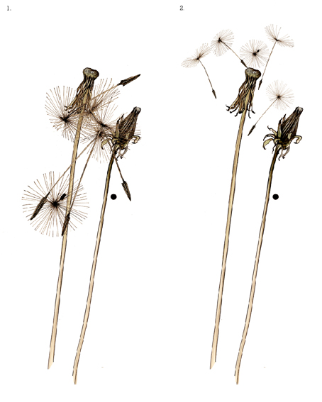
I started August's colours yesterday - the day was gloomy, nothing was working and eventually I turned the whole thing into the black and white above and gave up on it for the day. While it should be noted this August has felt quite wintry and at times monochromatic - this notebook is after all about colour! So... I came back to it today (refreshed) and here's what I decided on - in all its August glory...


...from my seasonal colour sample notebook.

Thursday, 30 August 2012

Colour from the season - Agapanthus Blue


Most of these sketches for my blog, I draw in a "legendary" Moleskine notebook which are ridiculously expensive but beautiful to use. Inside it says "used by artists and thinkers over the past two centuries" including van Gogh and Picasso - so it feels as though you can really achieve great things within them!

The downside of the A3 notebook is that the rather wonderful (Honesty seed pod) cream surface, rubs away to white when you use an eraser on it - I wonder if van Gogh had that problem (somehow I don't think so).

These are the colours from the statuesque Agapanthus (variety 'Luly'), flowering profusely this week - from the palest blue of a perfect flower, turning to deeper blue and pink as the flowers fade, finally the uniform green of the stem and leaves with deep purple at their base...


...from my seasonal colour sample notebook.

Thursday, 23 August 2012

Colour from the Season - Hot Poker yellow


These Yellow Hot Pokers (Kniphofia 'Bees Lemon') were more startling in their structure when they were just opening, but I missed that brief opportunity to draw them in their younger state. Happily, I see beauty in half dead and even completely dead plants (incidentally I find the music of Leonard Cohen quite uplifting) and the soft shade of brown from the dead flower heads next to that yellow of Summer easily makes up for their less sprightly form.

Tricky to draw - I started at the stalk about a quarter way down from the top and worked outward from there, very absorbing and a good way to unwind...


p.s. thanks ever so much to Judith who dug up some of her plant and left it on my doorstep thinking I might love it - I do..!


If you like this post - you can subscribe to Planet Sam by email :) here.


...from my seasonal colour sample notebook.

Monday, 20 August 2012

Treriefe House & Cornwall Design Fair

Back to my seasonal colours very soon - but thought I'd share a few photos from the Drawing room at Trereife House where I was invited to show my work.

The style of the room is Queen Anne from the early part of the 18th century (very Jane Austen!).
I left the fabrics on the rolls, there but in a temporary way. It was very successful.

Thanks very much to the Le Grice family for their generous hospitality.


Budgie Love cushion (well - the room is used for wedding receptions).


The perfect chair for the Monterey Cone to sit on.


Bald Eagle print looking rather stately.


and a little bit cross?


Red Squares fabric contrasting against the green cushions and rolling onto the rug.


Rosetta and Twine runners on Mahogany.


Lastly, not from the house but a detail from my stand in the exhibition tent itself. That particular piece of Twine fabric is now on its way to Maine and the birds flew off to very good homes too.


and look whooo was featured on Elle Decoration fb page about the fair..!


Tuesday, 14 August 2012

Cornwall Design Fair

I'm heading off to Cornwall tomorrow for the Cornwall Design Fair! Started by Hidden Art Cornwall in 2006, it's taking place in the fabulous grounds of Trereife House.

Looks as though I'll have a whole Parliament of Owls with me not to mention the Convocation of Eagles, as well as a Budgerigar or two squeezing in...could be quite a noisy trip!


(two colour screen prints from our rather cross birds series!)

So looking forward to meeting everyone at the private view on Thursday evening and during the Fair itself which continues from Friday 17th to Sunday 19th August..Hope to see you there!

Friday, 10 August 2012

Colour from the season - Olive leaf green

Awarded to Olympic victors (!) the Olive branch has been a symbol of peace and victory for thousands of years since it's origins in early Greek culture.

Using a dip pen and ink and line drawing is a great way to fully appreciate the simple form of the Olive branch. Drawing in this way without sketching first in pencil you have to look really hard and draw what's there, not what you think should or might be there. Sometimes I find I'm holding my breath with concentration. The dip pen brings its own free expression to the drawing.

I'd imagined the leaves would have more blue in the green, but these colours match the underside of the leaf and the stronger upper green of the older leaves exactly, shown next to the grey browns in the bark - peaceful colours..!


...from my seasonal colour sample notebook.

Monday, 6 August 2012

Colour from the season - Anemone red white & blue

It's not often I feel so patriotic, but I'm enjoying the Olympics - from the brilliant opening ceremony, onwards - so despite being madly busy at the moment, I just had to make time to flag up some red white and blue colours to wave wildly in my notebook!

Seemed to me that these (almost seasonal) energetic Anemones exactly fitted the bill...


...from my seasonal colour sample notebook.

Tuesday, 31 July 2012

Colours of the month - July

You may have heard - it rains a lot here in the U.K. We may or may not discuss the rain a fair amount as a nation - but one thing's for certain, thanks to the rain it's a very verdant landscape! Highlighting a few favourite greens from my July seasonal notebook.

Meadow grass green picked from high upon the coastal cliffs; A whisper of pink and a magical green from the Clover; Tart Gooseberry greens; Summer's blue and dune green of a Sea Holly; and just had to include lots of Mint green - looking as fresh as it tastes...


If you like this post - you can subscribe to Planet Sam by email :) here.


...from my seasonal colour sample notebook.

Monday, 30 July 2012

The little things - new old specs

The little things in life that make the difference...


...discovering that my dad's old specs are the
perfect magnification that I've been needing for
drawing has really made my day - (my week probably)..!

Tuesday, 24 July 2012

Table runners - Rosetta table runner

Thrilled to bits with the first prints of my china tea rose table runner - here's one of the first - hot of the print bed !

First screen - looks black but in fact is a deep smokey blue/grey...


Pure natural Irish linen - sustainable as well as beautiful...


That's real sunshine !!!! (I think I've been sad without the sun)...


Detail showing 2nd colour paler china grey/blue...


"Rosetta Glory"


Back to work!

Monday, 23 July 2012

Colour from the season - Gooseberry green

If you're looking for a lively addition to your greens palette then look no further. Sampled from a Gooseberry (in the flesh), and trending this month - this bristly berry green has a tartness about it that might make your mouth water...


(p.s.Summer's finally here!)
...from my seasonal colour sample notebook.


Saturday, 14 July 2012

Colour from the season - Red Clover pink

I picked this Red Clover in a magical place. An old quarry flooded to make a fishing lake, Carp lazing on the surface, the brilliant flash of a Kingfisher, Deer tracks at the waters edge, no traffic noise, no people, just quiet stillness.

The petals of the clover are (up to 300) tubular florets with zygomorphic symmetry! Though it's called Red Clover, there are in fact only pinks in the floret. Not that interesting on their own, but put them next to the warm brown of a fading flower and the deep green of a leaf and you have a colour palette which is also quite magical...


...from my seasonal colour sample notebook.

Wednesday, 11 July 2012

Cornwall Design Fair


I'm exhibiting at the Cornwall Design Fair in August - set
in the grounds of Trereife House, a beautiful Queen Anne
country manor house. I'm feeling quite excited because
I've been selected to exhibit my work inside the house
itself. More to come on this over the coming weeks...


In the meantime I've had a Monterey Pine cone moment... 
(more to come on this too!)


(re-posted)

Saturday, 7 July 2012

Screen Printing - Twine table runners

I've been screen printing in the studio the last few days as I've needed to re-print my Twine table runners, so thought I'd share the print process.
I love screen printing, as soon as I'd learnt to print at Camberwell Art college I was hooked. More recently I've used digital print production as well as laser etching in my work, but for the past year I've been screen printing almost everything I produce again and yes it is labour intensive, but I'm not planning on mass production!

Twine table runner in green colourway... (one at a time)...


Printing the green dye first - the runners are 180cms long so I have to print them lengthways down my print table.


Successful first colour printed.


Lining up the second screen to overprint a black outline.


Printing the black.


Lifting the screen is always a great moment!


detail of a perfect print !


Wednesday, 4 July 2012

Colour of the Season - Moroccan Mint green

This green might not be the colour we think of as mint green, but it's exactly the colour of Moroccan Mint (Mentha Viridis) growing in a pot in our garden.

4th July, 2012 is a very special day as my son Josse (who's studying Graphic design at Central St. Martins in London) has reached the grand old age of 21 today!!!!!!!!!!!!!!!!!!!!!

Green's one of his favourite colours and Mojito's his favourite cocktail ...so Happy Birthday to the lovely José xxx

and Happy Independence Day..!


hand painting (1992)


hand painting (Barack Obama 2009)


...from my seasonal colour sample notebook.

Saturday, 30 June 2012

Colours of the Month - June

June has been very wet...a monsoon of a month! The blackberry flowers seem to be paler this year, as though the pink has been washed right out of them.

Here are a few colours and drawings I've selected to represent June. Pink seemed to be the dominant colour in the wilds of North Devon, with hedgerows full of Foxgloves, Thistles (just opening), Pink Campion (not yet recorded in my notebook), Blackberry flowers (not quite as pink as last years?!).

The deep blood red blotches from the blackberry leaves are also included, alongside the plumage of the beautiful and sad Bullfinch. Right on the edge climbs the clashing poisonous colours of the Woody Nightshade...

Roll on July!
...from my seasonal colour sample notebook.

Saturday, 23 June 2012

Colour from the season - Lion Heart black

Sometimes I find myself trying to cmd z things when I'm not even on the computer. Imagine if you could undo anything with two fingers on a keyboard, go back and re-do them, I can think of one or two things I might cmd z. Maybe it's just as well that real life isn't too much like Photoshop etc. but right now it would be something at the very least to be able to add a few adjustment layers to increase the saturation and light levels!

This is a Lion Heart Lily, what it lacks in fragrance, it absolutely makes up for in colour - exquisite...


(Margaret the Lionheart x) ...from my seasonal colour sample notebook.

Friday, 15 June 2012

Colour from the season - Nasturtium orange


What's not to like about Nasturtiums?  Both flower and leaves are edible and rich in vitamin C (beware of the armour plated earwigs who like to lurk in the back of the flowers). The colour of the petals is such a vibrant orange/red that the paint couldn't match it, and it has the sweetest peppery fragrance when you get up close. When I was cutting it up to sample it, the smell touched a nerve in my memory that was so far back in my childhood that I couldn't quite reach it, or work out how I'd known it...


it did cross my mind when I was drawing it, that the shape of the flower pod reminded me of Alien - but then I have just recently been to see Prometheus.


...from my seasonal colour sample notebook.


Wednesday, 13 June 2012

the little things...my new iron

The little things in life that make the difference...

....the most stylish iron I've ever owned !


form as well as function - might admire it on a plinth for a few days.

Saturday, 9 June 2012

Colour from the season - Bullfinch orange

Helping Marie to get a print project off the ground, she told me that she spent the previous night printing and couldn't think of any better way to have fun on a Friday night! She asked what I'd been doing, and I told her I'd drawn a dead Bullfinch. I think my evening just had the edge over hers, though I know what she means about screen printing.

A friend found this beautiful (male) Bullfinch and gave it to me to draw. It was another rare opportunity to examine a wild bird closely.  This was the second sketch as I wanted to get it right - or until I felt ok with the drawing. The beak of the Bullfinch is designed for voraciously eating buds and fruit, the orange of its feathers is almost equal parts magenta and yellow...


Outline sketch and first brush work - (acrylic paint)


At this point I wasn't happy with it.


Its coming on Samantha - as my art teacher at school would say (usually when I'd finished).


...from my seasonal colour sample notebook.