Monday, 27 May 2013

Colour from the Season - Dandelion Seedhead Grey

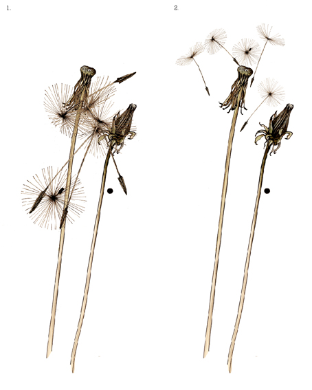
Yesterday I woke with the idea that I would deconstruct the parts of a Dandelion seed head and put them back together. It's great to wake up feeling inspired and I decided to act on it.

It was the most gorgeous May day, so I drew outside. No wonder Dandelions are so prolific – a brilliant piece of design, the parachuted seed heads take off on the slightest of breezes and little hooks to anchor them when they touch ground. I'm afraid there could be quite a lot of collateral damage in the garden next year.

Later that day I went to a crowded memorial service for industrial/graphic designer, teacher, mentor, automata maker and friend Tony Mann.
Tony inspired many people, including me. He had forceful opinions, especially about design and education, but was always ready to pass on his extensive knowledge and give constructive advice. One of the things he said to me was "What is it that has actually inspired you Sam? Don't ever write inspired by nature about your work, it's just wishy washy nonsense."

Which I've always taken on board, therefore...

Inspired by a Dandelion seed head – Analysis of the construction and colour.


(Just heard that I/my studio have been selected for an Artisan feature in Period Living magazine - very exciting!!) 

N.B. Discover the brilliant yellow of the Dandelion flower in an earlier notebook page here!

...from my seasonal colour sample notebook.

Monday, 20 May 2013

My favourite things – Still life with Night Light Clock

Another in 'a few of my favourite things' series...

I can't remember a time in my life when I wasn't surrounded by clocks and watches. That's because my dad was a watch and clock maker (still strange not to say is). One of my friends told me she remembers when she came to stay once and woke up every hour through the night.

My dad offered me a clock as an incentive to give up smoking and this is the one I chose. Took me a long time to actually own it, as I slipped back a number of times, and though I didn't let on that I was having the occasional roll up again, I didn't take the clock either.

This is a night light clock - the wrought iron surround is Victorian, the dial original of the same period, at the back it holds a candle. It's unusual and I've never seen another like it. However, the real interest (and excitement) was opening the back and discovering that the verge movement inside (almost certainly taken from a pocket watch) was made by a maker called Eardley Norton of St. John St. London, in 1762. One of the most important clock makers in the United Kingdom and clock maker to George III! 


Lichen, Moss, Ivy and Bramble (links to notebook pages), because they seemed the right sort of plants to clamber invasively over something so old.

Tuesday, 14 May 2013

Screen Printing - Studio sampling

A few photos in the studio showing some of the sampling stages of the new geometric design I've been printing.

The dye bench in my studio – 4.2 metres long (including sinks). The dyes piled up on the top of the cupboard are natural dyes, Lichen, Cochineal, Madder, Brazilwood, Walnut and many more. The oversize wooden spoons, turned blue from past Indigo vats, are great for dyeing. The old plough came with the building and the rabbit, a first test paper print, keeps a wary eye on everything.

My invaluable dye notebooks and scales.  Industrial Marigold gloves!


I'm printing onto natural (ie unbleached) linen. Here are some of the colours and first sample prints.


Two Belfast Sinks, one clean(ish), one dirty for washing dye-pots etc. Dyes/chemicals etc are stored underneath.


printed sample detail of indigo/brown colourway...after printing the fabrics are steamed to fix the dye, then washed thoroughly to remove excess dye, thickeners etc.

First full screen print.  I designed this geometric stripe originally to be laser etched into cork (as a very fine lined stripe) and I've always thought it would make a great design for fabric. A different variation of it is being (digitally) manufactured in the U.K. currently onto fabric lengths, based upon these samples I've printed in the studio. The design is startlingly modern and yet quite ethnic, even rustic in feel, and I think really successful. My design inspirations originally were influenced by the textiles of the Weiner Werkstätte and also Josef Albers, Formulation: Articulation. (links are to books I have).

These cushions are filled with 100% wool filled pads (http://www.woolsoft.co.uk), which importantly supports the UK wool industry, as well as being far more cosy than feathers. At 30"x 24", they will make a pretty impressive design statement to a room. Designed to be bed-cushions, they are I think, exactly perfect for lazy Sunday mornings!

Saturday, 11 May 2013

Colour from the season – Horsetail pink

Last week I was fascinated by the design and colours of this plant...

...but couldn't discover what it was. Not in books, nor on the web (I won't repeat some of the search words I resorted to). Just as well I've a couple of friends who seem to have an entire plant encyclopaedia in their heads! So...this is HORSETAIL (or the fertile stems of it anyway).

Honeycomb patterning on it's head (right) which becomes increasingly less defined as it ripens (left). Colours are light and breezy – sun bleached colours I thought? (wistfully). Full of healing and medicinal properties, Horsetail is also a really invasive weed I now discover, so hoping I didn't let any of its (murky green) spores loose in my garden or there'll be trouble...


(Thx P&B - who incidentally are also pretty good table tennis players).

...from my seasonal colour notebook.

Wednesday, 8 May 2013

Old Tea Rose - Stamping!

I'm delighted that some of my favourite illustrations from my colour notebooks on Planet Sam are being launched this week as card maker's stamp sets by 'Flourishes' who are based in Sunny Florida! Starting with Old Tea Rose (Read my original Tea Rose post here), they will be releasing a number of my illustrations as stamp sets over the coming months (see my interview yesterday on the Flourishes blog here)!

Many thanks to Jan Marie and the whole team at Flourishes for such a warm welcome! I'll be adding a link to the first set when it's released tomorrow (Here), very exciting! in fact I'm thinking I'd love to have some fun experimenting with these fabulous sets myself..! 
(for those of you new to my blog – I only wear (my dad's) specs for drawing!)

...from my seasonal colour sample notebook.

Saturday, 4 May 2013

Colour from the season – Ash red

You'll be pleased to hear that I've been keeping an eye on the Ash trees in Devon, and after what seemed like an age – they've done this!  Every hoof–like bud has exploded into tiny little red fruit like flower, truly extraordinary and I can hardly believe that I've gone through my whole life without noticing this before, but that's the case.

A hurried sketch, but you get the idea I hope. Also, I should add that within a day (indoors) these flowers had become seeds - which I don't have time to draw, so photo below...


See my previous post showing the Ash in bud here

Now heading off to a barn in the wilds of Devon to see Sheelanigig (think Balkan, Jazz, Folk mayhem) for a bit of a knees up! have a good wk/end.
...from my seasonal colour sample notebook.

Saturday, 27 April 2013

Colour from the season - Lily cream

I think the reason I'm attracted to draw dead plants and flowers is just because I like muted hues. It's a huge generalisation, but I think I'm less attracted to saturated colours.

These Lilies had died in a vase (before opening) last week at a friends house when I was there for a birthday dinner and so luckily, (because she is as creatively untidy as I am!), we were able to appreciate how strangely beautiful these flowers had become, withered as they were on their stems – a sort of fallen ethereal glory of faded blue green leaves, ancient ochred pods and burnt orange pollen.

Decided in a rash moment (forgetting how pollen can stain!) to bring these home to draw...


the Lilies at Elaine's on Clare's b'day..!


...from my seasonal colour sample notebook.

Monday, 22 April 2013

Colours from the Season - Rocket cream

Rocket is flowering in the garden – is that seasonal? seems a bit early to me. The flowers have a straggly fragile beauty - pretty in salads, despite the fact the petals could be likened to the wings of Crane Flies.

I live with the colours of Rocket in my kitchen, so maybe thats what drew its quiet presence to my notice...

...from my seasonal colour sample notebook.


Friday, 19 April 2013

Colour from the season - Snakes Head red

I recently had a very stern telling off from my paternal aunt who lives in India for wearing my dad's old specs (crikey!!). She said that I should no more wear someone else's spectacles than use their toothbrush!

Nothing else really to do then after that (!) except head off to the opticians. First stop was at a well known high street chain to see if they could repair my dad's ancient specs (two broken arms) and put prescription lenses in? I think they thought I was off my trolley.

So, without much hope I went to the local independent opticians in the small market town where I live and while they thought the specs almost beyond repair, they said that they'd send them off and see what could be done – and now, brilliantly, and not expensively, the specs are as good as new and I can see to draw again! (my eyes aren't that bad, but even to lose a small amount of clarity I've been finding has meant drawing has become more difficult as well as tiring).

Snakes Head Fritillary (Fritillaria meleagris) have a honeycomb/check on their petals that has something of the bleed effect of tie-dyed fabric. Muted purple petals, a vivid flash of yellow from the stamen, alongside a rather splendid shade of stem green and I can see that quite clearly...

...from my seasonal colour sample notebook.

Tuesday, 9 April 2013

Colour from the Season - Spring blues

Re-categorising and up-dating a few colour pages from the archive and thought I'd share. A few Spring blues, but not sad - very cheerful in fact! 

Muscari or Grape Hyacinth...
Hyacinth...


Mountain Cornflower...


and my favourite, Bluebell blues...


Original posts can now be found in the category...BLUE!

...from my seasonal colour notebook.

Sunday, 7 April 2013

Colour from the season - Duck Egg green

Spring arrived yesterday – only for the day, but what a day!

Our neighbour has (what I think are) Black Indian Runner Ducks and this morning she gave us some eggs. Wow! Duck Egg blue, or green as it turned out because the egg has more yellow than blue as well as a percentage of black.

I thought it would be a simple notebook page, one egg and one colour, but no, an egg is not an easy thing to draw..!


Distracted lately because at last I've started some new designs for fabric, in their infancy, they've been buzzing around in my head for a few months. Inspired by the Ivy, Roses, the block repeat post...

...from my seasonal colour sample notebook.

Wednesday, 27 March 2013

Colour from the Season - Bamboo Green

This Bamboo (Phyllostachys Nigra) has helped to brighten my Winter! It's simply been the most lively green outside my back door on even the darkest of days. I was adding colour to a drawing of it yesterday and decided it deserved a mention.

When I first tried to draw bamboo, I discovered that it dies quickly when you cut it. I cut a full stem and placed in water to draw, but within a few hours the leaves had rolled in on themselves - hopeless! The only thing to do was to draw it outdoors. So one Spring day, a few years ago, I sat on a low seat in the garden with a drawing board on my lap, a long roll of cartridge paper and starting at the base of the stem, I drew a full stem - not in pencil but directly in ink. I waited for the ink to dry then rolled the paper up, continuing to draw and roll until I reached the top. The following year (!) I decided that this one stem was a bit lonely and so I drew another! The drawings are approximately life size and measure 2.6 metres and 2.4 metres.

I then scanned these images, re-drew them in (Adobe) Illustrator, laser etched the first of them into Cork and exhibited this at 100% Design in London in 2009. For some time I've been thinking of adding colour as I'd like to screen or possibly digitally print them onto fabric. So here as a result, are the fresh colours as I noted them yesterday...


The first ink sketch...


The second...


Laser etched into Cork...


...from my seasonal colour sample notebook.

Monday, 18 March 2013

The Selvedge Spring Fair

On Friday and Saturday I shall be exhibiting at The Selvedge Spring Fair
In case you haven't heard of Selvedge magazine, it's an inspirational textile magazine, produced in the U.K. and I'm sure that the Selvedge Spring Fair, to be held in the King's Road, London (22nd and 23rd March) is going to be the perfect venue to exhibit my new products.

...So I've been really busy printing this past week or two and now I'm looking forward to getting out of the studio and spending a weekend in London, surrounded by textiles other than my own for a change! Here's a flavour of the local flora and fauna I'll be taking with me...

Pheasant cushion - who you may recognise from an earlier blog post here..!

Rabbit cushion - a personal favourite...

To co-ordinate with your Stag head? - Fawn cushion, a real sweetie!


On the print table...

following last years successful Budgie Love cushion! - Budgies and Chrysanths...


...and the very seasonal Rosetta Table Runner...


Do come and say hello if you're in London - or if you know someone who might be interested please forward/share, thank you!

here's the info...


Sunday, 17 March 2013

Colour from the season - Fern green

Sorry colour fans - just green, in fact two greens and two fairly nondescript greens at that. So if this doesn't interest you then no need to look any further at this post! If however, you might like to marvel at the elegant form of a Royal fern (as common as muck here in Devon), as well as the patience it's taken to draw, not once but many times over, then you might want to take a further peek!

I have ambitious plans for these drawings, so I've scanned all stages of their development, from pencil, to ink, to colour, but don't hold your breath, it may take some time...


au naturel...


...and just perfect for the next pattern post (mirrored block repeat)?

(Drawn listening to the excellent album 'Tramp' by Sharon Van Etten -  reflective video of the track Leonard here).

...from my seasonal colour sample notebook.

Monday, 11 March 2013

Colour from the Season - Oxalis Purpurea purple

I've been waiting patiently throughout the winter to note the colours and fascinating form of this plant. Just as I was planning to draw it last year, it stopped flowering and then went into total hibernation, at which point I thought I'd killed it (my house plants often only thrive if they're near the sink). But then, suddenly, about a month ago it started to re-emerge.

The leaves open and close like an umbrella, reminding me of an inspiring Issey Miyake pleats creation. The young leaves stay concertinaed for the first few days as they emerge, then as they grow fully they open almost inside out during the day and fold closely back together at night. The delicate flowers also open and close, but twisting inwards with a rotational twist - hard to describe, has really to be seen.

The colours change depending on the light, the time of day, the shadows. Pink and fresh green offset the deep purples and reds, exquisite...
...from my seasonal colour sample notebook.

Wednesday, 6 March 2013

Colours from the Season - Leaf Buds


Printing in the studio - it's exhausting and exhilarating! I wake up in the morning feeling as though I've been lifting weights! Yesterday was the most joyous Springlike day, the buds are coming into leaf on the trees and I felt a skip in my step again...

Coming back to the studio, I looked back over some of the best budding leaves in my notebook pages over the past 3 years and decided to update a few of them and group them together so I could find them more easily. I enjoyed re-visiting them, and thought you might too - so in one big WHOOSH! here they are...

Vibernum - exquisite and sculptural when they first open, look out for them in March...


Rosa Rugosa - starts coming into leaf in February - very very spiky...


Alder - I had no idea what this tree was when I drew it (in March) two years ago - I've learned so much from keeping this notebook...


Dahlia, I sat and drew this outside on a very cold April day!


Hydrangea - not budding yet or mine aren't - I drew this one in April...


Yesterday printing new runners (Budgie and Chrysanth)...


today Spring green...


...from my seasonal Colour sample notebook.

Saturday, 2 March 2013

Colour from the Season - Song Thrush brown

This week two things a bit out of the ordinary.

For weeks a friend (Pete) has been enjoying the song of a Thrush, then on Thursday, he found it dead  in his garden and was very upset about it. (He thought it was probably chased by a bird of prey causing it to fly into a shed and break its neck). He knew that I would like to draw it, and I did. It was incredible to draw and hold a Song Thrush I can tell you.

I sketched it twice - below some of the sketch developments,  I overworked the (first) sketch, because, well, I think I wanted to do my best, for the Song Thrush as well as for Pete's sake..!


First sketch at different stages ending in above...


Second sketch, much faster, I liked the detailing in the wing, and preferred the looseness of the drawing, but the first sketch won out for composition.

Then I got an email (Friday) offering me a late stand at the Selvedge Spring Show (A Textile fair in London) - in 3 weeks! - which I've taken them up on - better get printing...

...from my seasonal colour sample notebook.

Wednesday, 27 February 2013

The little things - New Cushions and Shop!


Before I completed my MA in Design (textiles) at Bath Spa University in 2008, I was selected to exhibit my fabric designs at 100%Design (trade fair) in London. For the next five years I showed my work at this prestigious and very exciting trade fair, exhibiting innovative textile fabrics and laser etched cork panels. My work was short-listed for the British Design awards with Rosemary Russet Fabric in 2007 and with Laser etched Cork Squares in 2010.


After five years of out-sourcing all (digital textile and laser) production, I realised, that I seriously missed screen printing and dyeing, the excitement (and messiness) of which had attracted me to a career in textile design in the first place.

So a little over a year ago I started to develop a collection of screen-printed furnishing accessories in my studio. This meant building an exposure unit, screen wash off room, buying screens, squeegees, emulsion, dyes, fabrics, etc. I decided to focus on small scale and bespoke production, use only the finest materials, sourcing, as far as possible from the UK, mainly printing onto un-bleached fabrics as a positive environmental choice.

Printing onto unbleached/natural fabrics has been the hardest in many respects (no white!). However the extensive knowledge I'm acquiring from the seasonal colour research in my blog is starting to pay off, selecting colours from my notebooks which have subtle natural harmony, reminiscent of the Exmoor landscape that surrounds me in North Devon, yet still looking contemporary and fresh. "Think modern rustic"!

Well I've made a few mistakes! and it certainly has been an emotional roller-coaster of a year - but I'm pleased to say I think that I'm now on the right track, at least I hope so! Best of all, my web shop is now fully up and running...


See the whole collection :-  Sam Pickard website/shop

Please feel free to share this post/image/link - thank you!!

Further links
Bath Spa University MA Design Textiles and Fashion
100%design


Wednesday, 20 February 2013

My favourite things - Still life with petals

A few of my favourite things...

A garden full of Hydrangeas and Roses (notebook May 2011 and Jan 2013), an old briefcase of my dads, and a 70's handbag which belonged to my mum (and who swung it with far more style than I've so far managed!). No real material value, just full of memories.


...from my seasonal colour sample notebook.